 |
ROLEXROLEXROLEXROLEXROLEXROLEX
 ROLEXROLEXROLEXROLEXROLEXROLEX
|
|
#1 |
|
"TRF" Member
Join Date: Nov 2019
Real Name: Jim
Location: UTC/GMT -7 hours
Posts: 1,673
|
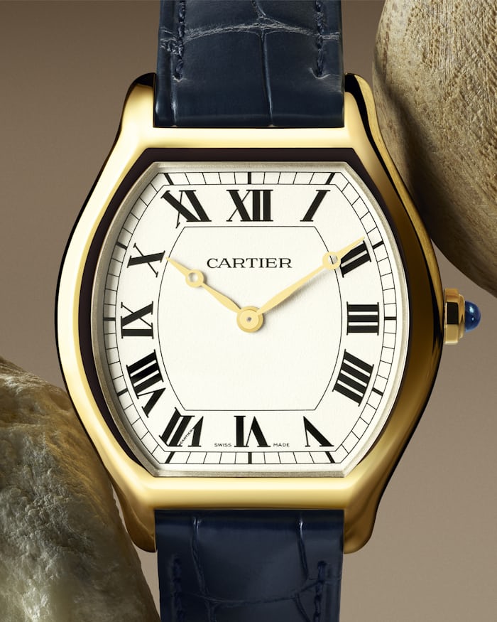
Cartier Tortue 2496C vs WGTO0006
I was hunting for a nice example of the 2496C before Cartier hit us with a new version of the Tortue.
Other than the price tag (~15k vs. ~30k) and dial design... is there a significant difference between the new model and previous model? I know the new one is limited to 200 but IIRC the previous model was also limited. Previous model has an open case back. I couldn't find information whether the new one does. I think I prefer the new dial layout and gold hands but I'm finding a hard time justifying the $15k premium over the previous model. Previous Model (2496C):  Current Model (WGTO0006): 
__________________
instagram: santiagowatchcollector |
|
|

|
|
|
#2 |
|
2024 Pledge Member
Join Date: Jan 2014
Location: london
Posts: 6,127
|
Personally I love blue hands and the guilloche dial.
__________________
@imrootbeer7 |
|
|

|
|
|
#3 |
|
"TRF" Member
Join Date: Jun 2020
Location: Geneva
Posts: 68
|
Movement has been updated with a tortue shape
|
|
|

|
|
|
#4 |
|
2024 ROLEX DATEJUST41 Pledge Member
Join Date: Jun 2008
Real Name: JYogi/Jeremy
Location: Metro Detroit USA
Watch: It's a Rolex!
Posts: 5,787
|
As said above, the movement has been changed and the new one looks really nice!
But I like the blued hands of the older model more. I don't think you can go wrong with either though. Here is the display back of the new version which is what I would want if buying one BUT you need to decide which makes more sense to you. I do find it interesting they kept the blued on the chrono. 
__________________
"You won't rise to the occasion - you'll default to your level of training." Barrett Tillman Kentucky Colonel, Tennessee Squire & Combat Leprechaun |
|
|

|
|
|
#5 | |
|
"TRF" Member
Join Date: Feb 2010
Real Name: Illusive Man
Location: NYC
Watch: Omega Worldtimer
Posts: 665
|
Quote:
__________________

|
|
|
|

|
|
|
#6 | |
|
"TRF" Member
Join Date: Nov 2019
Real Name: Jim
Location: UTC/GMT -7 hours
Posts: 1,673
|
Quote:
I think the display caseback is only on the chrono version. From what I saw on revolution watch video it looks like a solid case back on the time only. Sent from my iPhone using Tapatalk
__________________
instagram: santiagowatchcollector |
|
|
|

|
|
|
#7 |
|
"TRF" Member
Join Date: Feb 2013
Location: Bay Area
Watch: DD 40RG Olive dial
Posts: 4,579
|
Revolution Watch has a video on the Cartier releases and he talks about the new Tortue.
__________________
Michelle |
|
|

|
|
|
#8 |
|
2024 SubLV41 Pledge Member
Join Date: Aug 2014
Location: Cleveland
Posts: 2,155
|
Normally I'd say guilloche all day but the new one with the eggshell dial looks very crisp.
|
|
|

|
|
|
#9 |
|
"TRF" Member
Join Date: Jul 2012
Location: Rhode Island
Watch: Batman, Kermit
Posts: 1,097
|
Both versions are nice. The new case seems a little more streamlined and thinner in terms of the sides of the case. They are different enough that I can see some people preferring one case over the other.
The prior Collection Privee Cartier Paris (CPCP) version of the Tortue used caliber 437MC, based on a Piaget movement. I'm not sure if the time only Tortues were numbered (my CPCP Tank XL is numbered), but regardless all of the original Privee watches were made in very limited quantities. These are truly exceptional watches. Each dial was blanked in 18kt gold, and engraved and then coated with a fine layer of silver. Each movement is engraved with Cartier "C"s and the index assembly is finished with a Blued C de Cartier. They put a lot of high quality workmanship into each piece they made. Both versions are handsome, but I prefer the guilloche dial of the vintage CPCP Tortue and it's blued hands. Wishing you good luck and lots of fun with whatever you decide. |
|
|

|
|
|
#10 |
|
"TRF" Member
Join Date: Oct 2019
Location: Europe
Posts: 715
|
I really like the typeface of the logo + absence of “Paris” on the new one. Very sharp.
|
|
|

|
 |
| Currently Active Users Viewing This Thread: 1 (0 members and 1 guests) | |
|
|
*Banners
Of The Month*
This space is provided to horological resources.