
|
|
ROLEXROLEXROLEXROLEXROLEXROLEX
 ROLEXROLEXROLEXROLEXROLEXROLEX
 14 September 2021, 09:03 PM
|
#1 |
|
Banned
Join Date: Jul 2008
Real Name: Paul
Location: San Diego
Watch: 126619LB
Posts: 21,540
|
GMT Ceramic bezels too
. Wide?
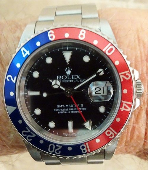
First, I need to give credit to HarryFlashman. Sir, I am using the picture you posted in another thread, I hope you dont mind but it is the best one I have seen that displays what I am referring to.
I owned a new Ceramic Pepsi a couple years ago, and got rid of it after a few months; I just never liked the way it looked. Now, those of you that have or are seeking to purchase one they are great watches  I just found it to be
Top Heavy. IMHO, the extra big numbers on the bezel really stand out, and make the bezel look too wide/big/prominent for a 40mm watch. If you look at the picture below, I think you will see what I am talking about. On the old (aluminum) bezels, the more subtle numbers (again IMHO) make the whole watch appear more proportionate, a cleaner-more balanced look for the 40mm size. I now have the 126610, and find the proportions absolutely perfect. It appears to lie flatter and on my wrist and aesthetically is the best size to bezel width ratio. I just found it to be
Top Heavy. IMHO, the extra big numbers on the bezel really stand out, and make the bezel look too wide/big/prominent for a 40mm watch. If you look at the picture below, I think you will see what I am talking about. On the old (aluminum) bezels, the more subtle numbers (again IMHO) make the whole watch appear more proportionate, a cleaner-more balanced look for the 40mm size. I now have the 126610, and find the proportions absolutely perfect. It appears to lie flatter and on my wrist and aesthetically is the best size to bezel width ratio. Does anyone agree with me? Or see what I am referring to? Or do I need more therapy?  
|

|

|
|
14 September 2021, 09:07 PM
|
#2 | |
|
2024 Pledge Member

Join Date: Apr 2018
Real Name: Harry
Location: England
Posts: 10,465
|
Quote:
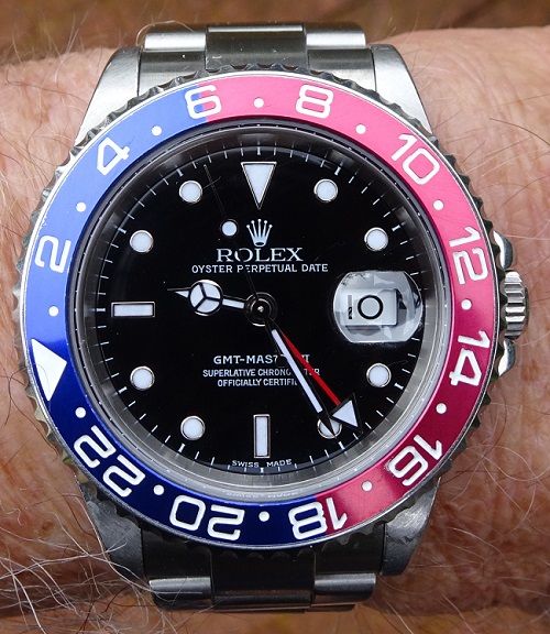
I have the TT CHNR. It is admittedly the only GMT Master I have ever owned, but I do like the proportions of the bezel/dial/case on this model. |
|
|
|
|
|
14 September 2021, 09:13 PM
|
#3 |
|
2024 ROLEX SUBMARINER 41 Pledge Member

Join Date: Jul 2013
Real Name: Brian (TBone)
Location: canada
Watch: es make me smile
Posts: 76,765
|
Different strokes Paul.
I remember when the ceramic GMT was launched in LN configuration. At that time many said the exact same thing. I believe some referred to the bezel numerals as "garish" or too bold. Ceramic in general has been a love / hate relationship. As for the case, I disagree. I know you own a Sub 41 as do I. I find that the caeeback of the 6 digit GMT wears flatter and is less "top heavy" than the Submariner which protrudes more. I guess in the end YMMV but I find the 6 digit GMT to be pretext darn near perfect  Edit: maybe you need to try it on a jubilee which wears extremely comfortable on my 7" flat wrist 20200116_143922.jpg20191231_200531.jpg Sent from my SM-G960W using Tapatalk |
|
|
|
|
14 September 2021, 09:17 PM
|
#4 | |
|
Banned
Join Date: Jul 2008
Real Name: Paul
Location: San Diego
Watch: 126619LB
Posts: 21,540
|
Quote:
 
|
|
|
|
|
|
14 September 2021, 09:26 PM
|
#5 |
|
2024 ROLEX SUBMARINER 41 Pledge Member

Join Date: Jul 2017
Location: USA
Watch: Neo-Vintage
Posts: 1,206
|
I think your issue is with the font/typeface used for the bezel numerals more than it is with the bezel being too wide. I dont think there is much of a bezel size difference between the GMT and Sub.
The 126710 and 116710 use a much more bold and sort-of-serif style font than used on the Submariner. On the Submariner, the Cerachrom is the main focus of the bezel, with the numerals secondary. On the GMT the numerals are the main focus with the Cerachrom secondary. There is certainly nothing wrong with preferring Cerachrom! But I think there is an argument that the bolder numerals help with legibility. AF4D5699-2FBF-4F7A-A50E-A8C5868FCC06.jpeg 757BE62D-50C1-4729-8F20-5FCDC01D4607.jpeg |
|
|
|
|
14 September 2021, 09:28 PM
|
#6 |
|
Banned
Join Date: Jul 2008
Real Name: Paul
Location: San Diego
Watch: 126619LB
Posts: 21,540
|
Thank you very much for posting these picks
And you may very well be right, it’s the font more then the bezel width that makes it look disproportionate (to me).
|
|
|
|
|
14 September 2021, 09:31 PM
|
#7 |
|
"TRF" Member
Join Date: Oct 2016
Real Name: Nick
Location: YUL
Watch: 16570
Posts: 1,936
|
To me most 6 digit Rolex models look wrong.
Maxi-everything for a bold in-your-face style. Not my cup of tea.
__________________
Nick _________________________________________ 14060M - 114200 - 114270 - 214270 - 16710BLRO - 16570 - 3570.50 - Cartier Tank Solo - Cartier Tank Française Yearling - CWC Navy Diver |
|
|
|
|
14 September 2021, 09:46 PM
|
#8 |
|
"TRF" Member

Join Date: Jun 2020
Location: Pittsburgh
Watch: 126710BLNR Jubilee
Posts: 7,004
|
The ceramic bezels are why I like Rolex. The older bezels look antique to me, outdated.
__________________
126710 BLNR Jubilee 
|

|
|
|
14 September 2021, 09:52 PM
|
#9 |
|
"TRF" Member
Join Date: Mar 2021
Location: United States
Posts: 104
|
I don't know the numbers, but I prefer the middle watch in post #5 over the left one....
|
|
|
|
|
14 September 2021, 09:55 PM
|
#10 |
|
"TRF" Member
Join Date: Jun 2020
Location: United Kingdom
Watch: Rollie
Posts: 781
|
I like the boldness of the 6-digit GMT bezel, one of the reasons I chose it over the Submariner. Has a more luxury feel (as opposed to tool watch).
On the Submariner, strangely I prefer the 14060M (non-maxi w/aluminium bezel) style. |
|
|
|
|
14 September 2021, 10:51 PM
|
#11 |
|
2024 ROLEX SUBMARINER 41 Pledge Member

Join Date: Sep 2015
Real Name: Richard
Location: GA
Watch: YTBD
Posts: 23,216
|
I see your point, and agree that it’s just different. I think it’s just a personal choice as to which aesthetic you prefer. Both fit their case proportions fluidly IMO. The bolder look of the 6 digit case coincides with its bezel numeral size, and same, more subtle numbers, for the 5 digit.
|
|
|
|
|
14 September 2021, 11:33 PM
|
#12 |
|
2024 ROLEX SUBMARINER 41 Pledge Member
Join Date: Mar 2013
Location: usa
Posts: 19,417
|
I just see blurple and cranberry
|
|
|
|
|
14 September 2021, 11:47 PM
|
#13 |
|
"TRF" Member
Join Date: Jun 2011
Location: Texas
Posts: 4,890
|
I think the bezel width is fine. I initially avoided the ceramic GMTs cause I thought the numbers were too big. Now, I'm use to it and it doesn't bother me since everything else is big (maxi case, bigger markers/hands, etc.)
|
|
|
|
|
14 September 2021, 11:54 PM
|
#14 |
|
"TRF" Member

Join Date: May 2008
Location: USA
Posts: 2,194
|
I see what the OP has noticed, but I don't personally mind. The ceramic bezel is a neat feature of the watch, so it doesn't bother me that it's a bit more prominent or broad than in the 5 digit watches.
__________________
t65tampa |
|
|
|
|
14 September 2021, 11:59 PM
|
#15 |
|
"TRF" Member

Join Date: Mar 2018
Location: United States
Watch: Ever changing!
Posts: 1,150
|
I totally agree. The wide bezel and oversized everything of the 6 digit references just makes them feel bloated... They're not for me.
The 1675 has a wide bezel, maxi markers and looks proportional. Those are your sweetspot. |
|
|
|
|
15 September 2021, 01:25 AM
|
#16 |
|
"TRF" Member
Join Date: Jun 2018
Location: East Coast
Watch: 16610
Posts: 4,933
|
It’s too wide, too shiny, and too pastel.
|
|
|
|
|
15 September 2021, 01:35 AM
|
#17 |
|
"TRF" Member

Join Date: Nov 2019
Location: Sunshine State
Watch: lots of Rolex
Posts: 4,952
|
I see the difference in the fonts and see your point. The newer, more prominent font doesn't bother me and think the ceramic bezel size is fine.
__________________
126610LV//116508 Daytona YG Black/Champagne 116655 YM40 Everose Oysterflex//126622 YM40 Blue//126600 SD43 126710BLNR//126711CHNR 126334 DJ41 Rhodium/Diamonds//126331 DJ41 TT Wimbledon 124300 OP41 Green//126334 DJ41Mint Green |
|
|
|
|
15 September 2021, 01:48 AM
|
#18 |
|
"TRF" Member
Join Date: Oct 2011
Location: Chicago
Posts: 116
|
I like the ceramic bezel for its functionality. But I bought a GMT when the six digits were introduced and purposely chose a five digit for the exact reason you stated. My favorite ceramic bezel is the Daytona. I think the font that looks like the older model helps.
|
|
|
|
|
15 September 2021, 02:13 AM
|
#19 |
|
"TRF" Member
Join Date: Jun 2009
Location: Virginia
Posts: 257
|
I think the larger indices on the maxi dial warrant a larger font on the ceramic bezel.
|
|
|
|
|
15 September 2021, 02:19 AM
|
#20 |
|
"TRF" Member

Join Date: May 2013
Real Name: Nick
Location: Las Vegas
Watch: 1601
Posts: 10,577
|
GMT Ceramic bezels too
. Wide?
I disagree Paul and find that they got the modern proportions just right.
Where others see wider as a negative aesthetic, I find it to be more functional as it is highly visible. Aesthetics wise, the modern maxi cased sports Rolex would have too much dead space with smaller/thinner numbers on the bezel.  With regard to being top heavy. I wear my watches with a snug fit and have never experienced the top heavy complaint that accompanies watches like the Milgauss, SeaDweller, BlackBay, and now the GMT. Get the 5 digit if you prefer classic proportions. Get the 6 digit if you like modern proportions. |
|
|
|
|
15 September 2021, 02:49 AM
|
#21 |
|
"TRF" Member
Join Date: Sep 2020
Location: Houston
Posts: 1,090
|
I love the new ones. Great modern update on a classic. It looks different but you can easily see the lineage.
|
|
|
|
|
15 September 2021, 03:04 AM
|
#22 |
|
"TRF" Member
Join Date: Sep 2010
Location: Anchorage Alaska
Posts: 604
|
The modern bezel certainly fits the modern case and dial. For me the modern GMT is “too” everything. It’s a simple matter of preference. If I could swap straight across a 5 digit for a six I wouldn’t.
|
|
|
|
|
15 September 2021, 03:08 AM
|
#23 |
|
"TRF" Member

Join Date: Sep 2011
Location: USA
Posts: 5,621
|
Yeah, I don't really have eyes for much of anything after the 5-digit series of watches, outside of maybe some of the simpler models like the OP.
|
|
|
|
|
15 September 2021, 03:28 AM
|
#24 |
|
TRF Moderator & 2024 SUBMARINER Patron

Join Date: Dec 2007
Real Name: Ken
Location: SW Florida
Watch: One on my wrist.
Posts: 63,866
|
No can’t say I do Paul.
__________________
 SPEM SUCCESSUS ALIT |
|
|
|
|
15 September 2021, 03:31 AM
|
#25 |
|
"TRF" Member
Join Date: Oct 2017
Location: East coast
Posts: 6,655
|
16710 is the OG and best!!
|
|
|
|
|
15 September 2021, 03:34 AM
|
#26 |
|
2024 ROLEX SUBMARINER 41 Pledge Member

Join Date: Aug 2020
Real Name: Stan Cooper
Location: Sonoma County, CA
Watch: GMT-Master II
Posts: 2,851
|
Personally, I'm a fan of the font on the Cerachrom insert, but not the ceramic material. I find the font legibility an improvement over the aluminum insert font. The "ceramic" insert is aftermarket. This is the same 16710 in both photos.
__________________
 ♛16710 GMT-Master II, ♛1915 Rolex WW1 Trench Watch, Zelos Thresher 500m GMT Meteorite, Zelos Swordfish 40 200m Ti Blood Moon Meteorite, Hamilton Pilot Chronograph, Ball Roadmaster Pilot GMT COSC Chronometer, Zelos Mako 300M True GMT Meteorite, Seiko SSC813 quartz solar powered chronograph ♛16710 GMT-Master II, ♛1915 Rolex WW1 Trench Watch, Zelos Thresher 500m GMT Meteorite, Zelos Swordfish 40 200m Ti Blood Moon Meteorite, Hamilton Pilot Chronograph, Ball Roadmaster Pilot GMT COSC Chronometer, Zelos Mako 300M True GMT Meteorite, Seiko SSC813 quartz solar powered chronographIt's weird being the same age as old people. - Stan |
|
|
|
|
15 September 2021, 03:49 AM
|
#27 | |
|
"TRF" Member

Join Date: Oct 2011
Real Name: Jason
Location: Essex, UK
Watch: 14060M
Posts: 2,943
|
Quote:
That's because you are smart..
__________________

|
|
|
|
|
|
15 September 2021, 12:24 PM
|
#28 |
|
2024 Pledge Member

Join Date: Feb 2018
Location: California
Posts: 1,250
|
The design aesthetics of the pre ceramic GMT’s are much finer than the latest version.
I agree that the bezel is too wide on the ceramic version. The case is too wide as well. The numerals on the bezel are too large. The red and blue colorway can’t match the vibrancy of the older models. |
|
|
|
|
15 September 2021, 12:43 PM
|
#29 | |
|
2024 Pledge Member

Join Date: Aug 2013
Location: Oklahoma
Posts: 1,960
|
Quote:
__________________

|
|
|
|
|
|
15 September 2021, 07:39 PM
|
#30 |
|
"TRF" Member
Join Date: Mar 2020
Location: Midwest
Posts: 1,682
|
My fading pilot eyes appreciate the larger font!
|
|
|
|
 |
| Currently Active Users Viewing This Thread: 1 (0 members and 1 guests) | |
|
|


*Banners
Of The Month*
This space is provided to horological resources.


 Linear Mode

