 |
ROLEXROLEXROLEXROLEXROLEXROLEX
 ROLEXROLEXROLEXROLEXROLEXROLEX
|
|
#31 |
|
"TRF" Member
Join Date: Jun 2013
Location: TX
Watch: Daytona
Posts: 3,231
|
|
|
|

|
|
|
#32 |
|
"TRF" Member
Join Date: May 2008
Location: SNA
Posts: 3,635
|
Been paying closer attention to the length of hands on Rolexes vs minute markers, and I think the Daytona did it perfectly, with the minute hand long enough to almost reach the halfway point on the minute markers.
Should be that way on the DSSD, Subc, etc. |
|
|

|
|
|
#33 |
|
TRF Moderator & 2024 SubLV41 Patron
Join Date: Jul 2013
Real Name: Adam
Location: Far East
Watch: Golden Tuna
Posts: 28,782
|
|
|
|

|
|
|
#34 |
|
"TRF" Member
Join Date: Jun 2013
Location: TX
Watch: Daytona
Posts: 3,231
|
|
|
|

|
|
|
#35 |
|
TRF Moderator & 2024 SubLV41 Patron
Join Date: Jul 2013
Real Name: Adam
Location: Far East
Watch: Golden Tuna
Posts: 28,782
|
|
|
|

|
|
|
#36 | |
|
2024 SubLV41 Pledge Member
Join Date: Dec 2011
Location: RedSox Nation
Watch: U Talkn Bout Wilis
Posts: 5,495
|
Quote:
 
__________________
I'm a sailor peg. And I've lost my leg. Climbing up the top sails. I've lost my leg! |
|
|
|

|
|
|
#37 |
|
"TRF" Member
Join Date: Jun 2013
Location: TX
Watch: Daytona
Posts: 3,231
|
Personally, the only thing I think could be better in 216570 is the name on the dial. I would have preferred the 'Explorer II' in orange to be displayed at the bottom side(where Submariner and other watch names are written). It would have given it more balance to the dial. Seems, no consistent behavior from Rolex in this aspect.
I know Explorer II name always had it at the top side of the dial but even Explorer I had the same but when they did the redesign and increased dial size, they moved it bottom. Should have done the same for Exp II. |
|
|

|
|
|
#38 |
|
"TRF" Member
Join Date: Apr 2015
Real Name: Arnold
Location: New York
Watch: SD4K+BLNR
Posts: 849
|
with the thrusting gif, now I see why the minute hand is so long. It is the proportion. Since the snowflake hour hand has such presence ( realestate wise), a shorter minute hand will make the watch over power by the hour hand. The extra realestate of the minute hand is to balance out the hands.
|
|
|

|
|
|
#39 | |
|
"TRF" Member
Join Date: Jan 2012
Location: USA
Posts: 197
|
Quote:
|
|
|
|

|
|
|
#40 |
|
"TRF" Member
Join Date: Mar 2007
Real Name: Mik
Location: USA
Posts: 13,723
|
I had a 210 that I did aftermarket hands on to make them longer. Looked awesome IMHO.
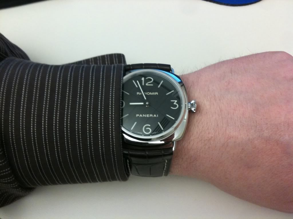
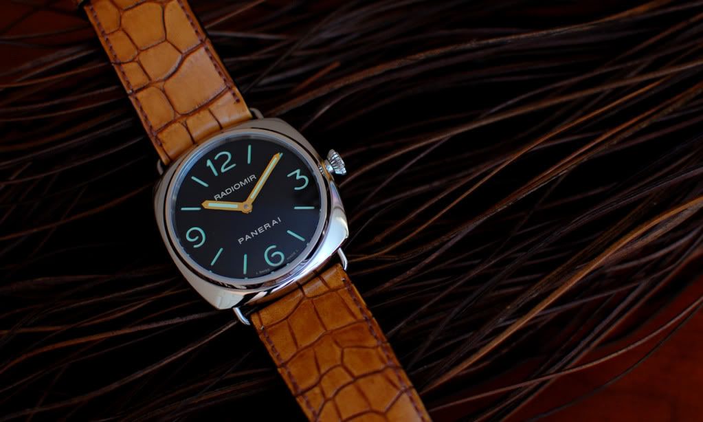
before (not bad):  after (better):  I tried to get after market hands for my 214270, but couldn't find any. I love that watch, but the hands ruined it for me. There are other watches I can't think of that I feel would look much better with larger hands. I just remember looking at them and saying "I wish the hands were longer". They should at a minimum, reach very close to the minute tics. Most Rolex are ok, but I think if they were minutely longer it would be even better IMHO. I just look at some of the vintage explorers and subs with really big hands and I love that look (patina aside).
__________________
member#3242 |
|
|

|
|
|
#41 |
|
"TRF" Member
Join Date: Mar 2007
Real Name: Mik
Location: USA
Posts: 13,723
|
__________________
member#3242 |
|
|

|
|
|
#42 | |
|
"TRF" Member
Join Date: Jun 2013
Location: TX
Watch: Daytona
Posts: 3,231
|
Quote:
|
|
|
|

|
|
|
#43 | |
|
"TRF" Member
Join Date: Mar 2007
Real Name: Mik
Location: USA
Posts: 13,723
|
Quote:
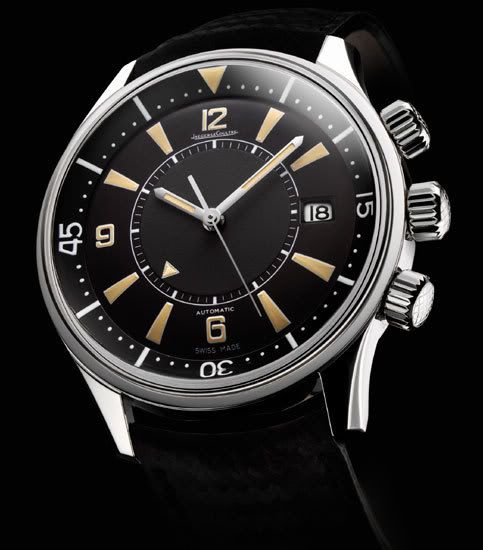
A watch example that I feel has hands that are to short came to me. JLC Memovox Tribute to Polaris 1968 Just doesn't look sized right (to me). Maybe it is the big open dial and large indices. Bigger hands would make it perfect to me. I still love it and have thought of it often. 
__________________
member#3242 |
|
|
|

|
|
|
#44 |
|
"TRF" Member
Join Date: Sep 2014
Real Name: Angelo
Location: Brooklyn, NY
Watch: Rolex Submariner
Posts: 42,164
|
I think the longer hand looks perfect on that watch.
|
|
|

|
 |
| Currently Active Users Viewing This Thread: 1 (0 members and 1 guests) | |
|
|
*Banners
Of The Month*
This space is provided to horological resources.