
|
|
ROLEXROLEXROLEXROLEXROLEXROLEX
 ROLEXROLEXROLEXROLEXROLEXROLEX
 12 October 2022, 10:14 AM
|
#1 |
|
"TRF" Member
Join Date: Nov 2021
Location: Washington, DC
Posts: 1,706
|
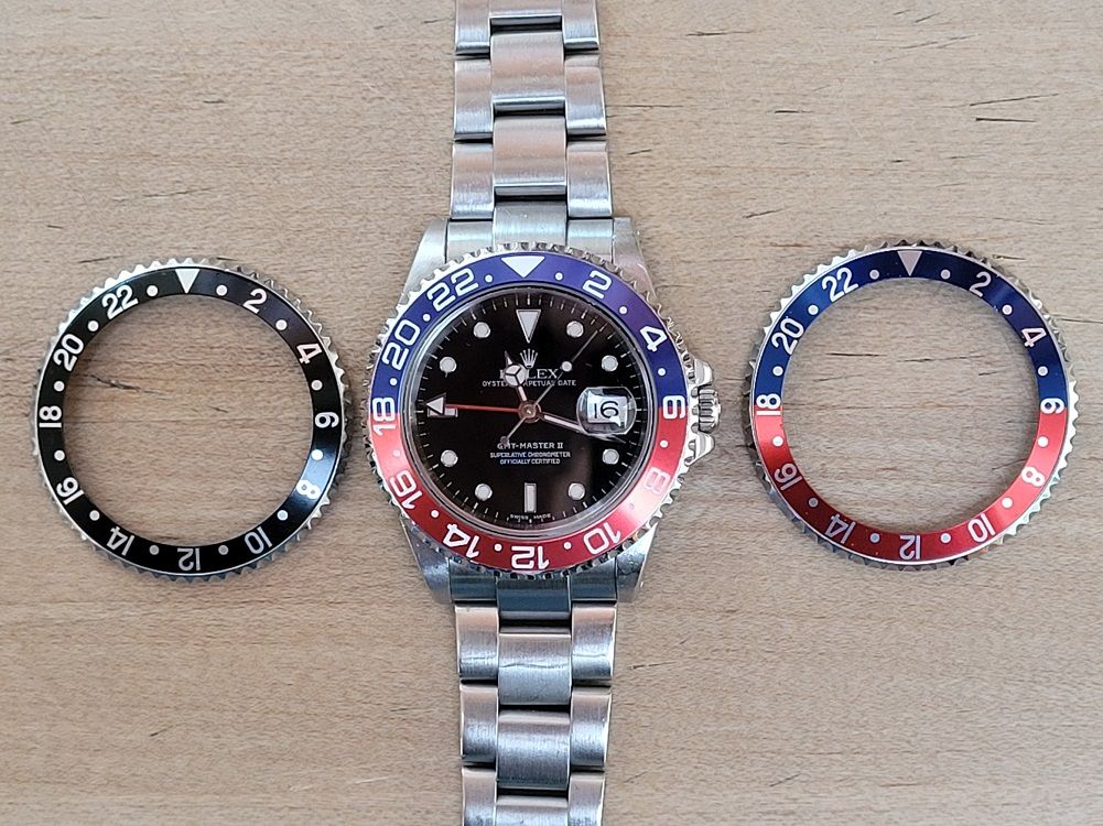
Why are the numbers on the GMT so big?
I came to Rolex wanting a Pepsi, but in the end decided that it was too flashy for me and I looked at other models. When I thought about it though, the main reason I dont like it is because the numbers on the bezel are too big (in my opinion). If the numbers were the same size as the numerals on the Sub, I think that would have been great. Any idea why they did that when they moved from 5 to 6 digit GMT? And for those that like it, would you like it as much on the submariner?
|

|

|
|
12 October 2022, 10:19 AM
|
#2 |
|
"TRF" Member
Join Date: Jan 2017
Location: Los Angeles
Posts: 947
|
Having owned both sub and gmt still own the gmt, it honestly does not bother me. Fills out the bezel nicely and gives the watch good contrast.
|
|
|
|
|
12 October 2022, 10:21 AM
|
#3 |
|
"TRF" Member

Join Date: Feb 2018
Real Name: Roger Lococco
Location: Asia
Watch: 126719BLRO Pepsi
Posts: 2,997
|
Why are the numbers on the GMT so big?
Looks great to me.
 Sent from my iPhone using Tapatalk
__________________
116500 Daytona White Dial 126710BLNR GMT II 126719BLRO Blue Dial Pepsi GMT II |
|
|
|
|
12 October 2022, 10:23 AM
|
#4 |
|
2024 ROLEX SUBMARINER 41 Pledge Member

Join Date: Jul 2017
Location: USA
Watch: Neo-Vintage
Posts: 1,212
|
On the Sub, the numerals are thin, so the Cerachrom shines through and is the focus of the bezel.
On the GMT the numerals are large and bold, so the numerals shine and the cerachrom is secondary. Not saying one is better than the other, but the cerachrom on a Sub really does stand out more than the GMT. |
|
|
|
|
12 October 2022, 10:36 AM
|
#5 |
|
"TRF" Member
Join Date: Nov 2021
Location: Washington, DC
Posts: 1,706
|
I want to make it clear I dont think its bad, I just prefer the smaller numerals. Im curious on why it changed.
|
|
|
|
|
12 October 2022, 10:36 AM
|
#6 |
|
2025 Pledge Member

Join Date: Aug 2020
Real Name: Stan Cooper
Location: Sonoma County, CA
Watch: GMT-Master II
Posts: 2,990
|
I'm a fan of the big font on the ceramic bezel inserts. In fact, I fitted an aftermarket ceramic insert to my 16710. I still swap in the original anodized aluminum inserts about half the time.
__________________
 ♛16710 GMT-Master II, ♛1915 Rolex WW1 Trench Watch, Zelos Thresher 500m GMT Meteorite, Zelos Swordfish 40 200m Ti Blood Moon Meteorite, Hamilton Pilot Chronograph, Ball Roadmaster Pilot GMT COSC Chronometer, Zelos Mako 300M Traveler GMT Meteorite, Seiko SSC813 quartz solar powered chronograph ♛16710 GMT-Master II, ♛1915 Rolex WW1 Trench Watch, Zelos Thresher 500m GMT Meteorite, Zelos Swordfish 40 200m Ti Blood Moon Meteorite, Hamilton Pilot Chronograph, Ball Roadmaster Pilot GMT COSC Chronometer, Zelos Mako 300M Traveler GMT Meteorite, Seiko SSC813 quartz solar powered chronographIt's weird being the same age as old people. - Stan |
|
|
|
|
12 October 2022, 10:51 AM
|
#7 | |
|
"TRF" Member

Join Date: May 2008
Location: SNA
Posts: 3,646
|
Quote:
But it does make the watch look a bit more different than my Sub. Otherwise, they look pretty much the same. |
|
|
|
|
|
12 October 2022, 10:58 AM
|
#8 |
|
"TRF" Member

Join Date: Aug 2020
Real Name: Alex
Location: Canada
Posts: 1,740
|
Funny enough, when I bought my 116610LN in 2017, there was an all black GMT in the display case. I asked my wife what she thought and she said the numbers were too big in the bezel. I agreed and chose the SubDate. No regrets.
A few years later I purchased a BLNR on jubilee. I still think the numerals are still slightly too big but I like how it differentiates itself from the Sub. Two similar watches but still very different.
__________________
Submariner Date 116610LN | GMT-Master II 126710BLNR on Jubilee | Explorer Rolesor 124273 | Submariner Date Bluesy 126613LB |
|
|
|
|
12 October 2022, 11:22 AM
|
#9 |
|
"TRF" Member

Join Date: Jun 2020
Location: Pittsburgh
Watch: 126710BLNR Jubilee
Posts: 7,244
|
I have never been a fan of the large numbers on the GMT in photos. I liked the blue on the BLNR so I wanted it. In person the numbers are not something that stands out to me. I do like the clean look of the sub better, but the numbers size are not a factor to me either way on the GMT.
__________________
126710 BLNR Jubilee 
|
|
|
|
|
12 October 2022, 11:42 AM
|
#10 | |
|
"TRF" Member
Join Date: Jun 2018
Location: East Coast
Watch: 16610
Posts: 4,933
|
Quote:
|
|
|
|
|
|
12 October 2022, 11:51 AM
|
#11 | |
|
"TRF" Member
Join Date: Jul 2015
Location: Georgia, USA
Watch: 116660
Posts: 507
|
Quote:

|
|
|
|
|
|
12 October 2022, 12:34 PM
|
#12 |
|
"TRF" Member
Join Date: Sep 2021
Location: New Zealand
Posts: 49
|
Given the average wait time to acquire one I suspect most buyers eyes benefit from the larger size numerals.
|

|
|
|
12 October 2022, 01:33 PM
|
#13 | |
|
"TRF" Member
Join Date: Aug 2022
Location: Cali
Posts: 1,955
|
Quote:
 My eyes have gotten worse since I got on the list all those years ago! Still waiting
.. me and the wait are getting old! My eyes have gotten worse since I got on the list all those years ago! Still waiting
.. me and the wait are getting old!
|
|
|
|
|
|
12 October 2022, 01:49 PM
|
#14 |
|
"TRF" Member
Join Date: Mar 2022
Location: Virginia
Posts: 132
|
Poor design in my opinion. Non cerachrome were perfect in text.
|
|
|
|
|
12 October 2022, 05:53 PM
|
#15 | |
|
"TRF" Member
Join Date: Sep 2021
Location: Home
Watch: Patek Aquanaut
Posts: 837
|
Quote:
|
|
|
|
|
|
12 October 2022, 06:21 PM
|
#16 |
|
2024 Pledge Member

Join Date: May 2008
Real Name: Steve
Location: Canada
Watch: 16753; Bellini Dia
Posts: 1,770
|
Ive a feeling that they wanted to recapture the proportions of the 1675 bezel, which was wider than those on the 16700 and 16710. As a result, the numbers on the 1675 bezels were bigger than on the 16710 (especially on the fat-font bezel).
When Rolex upped the 5 digit to the maxi-case 6 digit, the dial, markers, and bezel sized all increased proportionally. This made the 116710 like a slightly bloated version of the 1675 but without some of the refinements. They kinda did it, but something of the grace was lost. The 1675 is my favourite reference with the pot-less markers and matt dial, all it really needed was a 1mm size increase on the case and a larger crown. (Middle two photos not mine; top and bottom, mine).     Sent from my iPhone using Tapatalk
__________________
The trouble with having an open mind, of course, is that people will insist on coming along and trying to put things in it.   SS Submariner no date 1992 (sold); SS GMT II 2007 (sold); SS GMT II C 2008 ('M' series) (sold); SS Sub C 2011 (sold); BB GMT 1971 (sold); Omega 50th GMT |
|
|
|
|
12 October 2022, 06:27 PM
|
#17 | |
|
Banned
Join Date: Mar 2021
Location: Maryland
Watch: Daytona
Posts: 160
|
Quote:
|
|
|
|
|
|
12 October 2022, 07:05 PM
|
#18 |
|
2025 Pledge Member

Join Date: Apr 2018
Real Name: Harry
Location: England
Posts: 10,904
|
They are made like that so I can read them easily.
|
|
|
|
|
12 October 2022, 07:14 PM
|
#19 |
|
"TRF" Member
Join Date: Jun 2020
Location: United Kingdom
Watch: Rollie
Posts: 828
|
I like the GMT design. Bezel font was probably done to further differentiate from the Submariner and for legibility.
|
|
|
|
|
12 October 2022, 07:28 PM
|
#20 |
|
2025 Pledge Member

Join Date: Aug 2012
Real Name: Lee
Location: 42.48.45N70.48.48
Watch: Too many to list!
Posts: 33,800
|
In general, this type of watch choice falls into the hype category, imho. "I would buy a GMT if the numbers weren't so flashy." Personally, I'd buy a GMT if I needed the functionality that it provided. If I truly needed the function then it would matter little the size of the bezel engraving. Buying just because others have it makes little sense to me. I won't own a GMT due to not having a need for the function. A Sub on the other hand, I can use.

|
|
|
|
|
12 October 2022, 07:46 PM
|
#21 |
|
2025 Pledge Member

Join Date: Sep 2019
Real Name: Randy
Location: Midwest USA
Watch: Blue Sky
Posts: 3,202
|
Why are the numbers on the GMT so big?
Legibility is a good thing. The numbers are spot on, perfection on my wrist!!!
 
|
|
|
|
|
12 October 2022, 08:08 PM
|
#22 |
|
2025 Pledge Member

Join Date: Jul 2013
Real Name: Brian (TBone)
Location: canada
Watch: es make me smile
Posts: 79,496
|
I’d prefer if they had gone with a more understated size

|
|
|
|
|
12 October 2022, 09:36 PM
|
#23 | |
|
"TRF" Member
Join Date: Nov 2021
Location: Washington, DC
Posts: 1,706
|
Quote:
Buying just because others have it? Huh? Also, you realize other companies make GMT watches? |
|
|
|
|
|
12 October 2022, 09:48 PM
|
#24 | |
|
2025 Pledge Member
Join Date: Aug 2012
Real Name: Lee
Location: 42.48.45N70.48.48
Watch: Too many to list!
Posts: 33,800
|
Quote:
|
|
|
|
|
|
12 October 2022, 09:50 PM
|
#25 | |
|
"TRF" Member
Join Date: Jun 2018
Location: East Coast
Watch: 16610
Posts: 4,933
|
Quote:
|
|
|
|
|
|
12 October 2022, 10:10 PM
|
#26 |
|
2025 Pledge Member

Join Date: Dec 2014
Real Name: Andrew Wilson
Location: Brunswick, Maine
Watch: 16550 Explorer II
Posts: 1,773
|
As the Wolf disguised as Grandma said "Better to see you with, my dear."
Little Red Riding Hood was not impressed with the talking Wolf. 
__________________
6284 SS, 16014 SS Jubilee silver stick, 16253 TT Blue Thunderbird, 16550 SS Exp II Cream, bought in 1986, 116400GV Z-blue Milgauss, 79260 Tudor, 116660 DSSD-Blue, 116500LV Daytona White, 116710 BLNR, 326934 Blue Skydweller |
|
|
|
|
12 October 2022, 11:05 PM
|
#27 |
|
2025 Pledge Member

Join Date: Jul 2013
Real Name: Mike
Location: Downy Ocean Hon
Watch: my money leaving!
Posts: 13,991
|
Check out the Tudor GMT. The bezel may be more to your liking. Definitely less flashy too.

|
|
|
|
|
12 October 2022, 11:13 PM
|
#28 |
|
"TRF" Member

Join Date: Feb 2012
Location: Chicago
Watch: explorer
Posts: 2,323
|
Totally agree and the font size used on the modern GMT bezels has been a blocker for me. It ruins the focus, your eyes are pulled out to the bezel on a quick glance. The focus should be on the dial which always displays local time.
|
|
|
|
|
12 October 2022, 11:13 PM
|
#29 |
|
2025 Pledge Member
Join Date: Mar 2017
Location: United States
Watch: Rolex and Patek
Posts: 11,773
|
I find the color scheme of blue/red bezel to be flashier than the font size. I actually like the increased legibility and ease to set occasioned by the larger font. Would I wear, most likely not. I would love to see the all black model with green hand re-introduced.
|
|
|
|
|
13 October 2022, 12:28 AM
|
#30 |
|
"TRF" Member

Join Date: Jan 2009
Real Name: Larry
Location: Kentucky
Watch: Yes
Posts: 35,185
|
IMO, the GMT 2c design came at a time when Rolex was trying to make a clear break from the time of the 5 digits. A more aggressive one, if you will. Ceramic bezels were now the rage, along with the wider lugs of the sub-c, and of course, as you mention, the larger bezel numbers on the GMT.
As to whether I like it...yeah, I guess. It seems to go well with the shift toward the modern. For me, however, I think the older ones are cooler and give off a vibe the newer ones will never come close to.
|
|
|
|
 |
| Currently Active Users Viewing This Thread: 1 (0 members and 1 guests) | |
|
|


*Banners
Of The Month*
This space is provided to horological resources.


 Linear Mode

